To say I am a fan of the Barbican is an understatement, I love the place! No matter how many times I visit, whenever I go (and that is normally a few times every month) I am filled with a child like glee beforehand. You could say, like a kid in a concrete sweet shop. When the Barbican approached me to participate in the ‘New Brutal’ season, joy and panic were prevailing feelings. I say panic as I immediately thought about what to leave out of the ‘Brutal Sights’ photography tour and accompanying poster. For me, an important point to consider from the outset as I like pretty much all of the Barbican estate and the surrounding views into the estate.
The joy of the Barbican is the many incidental frames that the various structures and views offer you
When working or looking at buildings I often refer back to a book I was introduced to when I was studying at Chelsea School of Art. Ways of Seeing by John Berger, a book that showed me early on that it is OK to have your own point of view when looking at things. This book has given me the freedom to explore and enjoy concrete, Brutalism, the built environment and just as important the heavy industry that surrounded me in my home town of Middlesbrough .
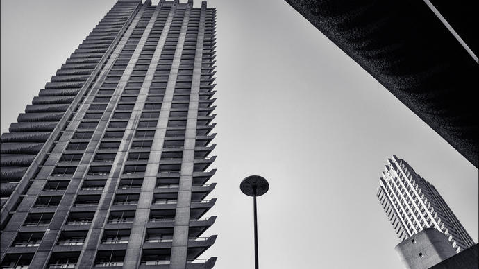
The joy of the Barbican is the many incidental frames that the various structures and views offer you. I tend to look beyond the wide open crowd pleasing expanses the estate offers and seek out more intimate viewpoints and crops. With this in mind, these personal and favourite view points inform and direct these commissioned works for the Barbican.
Where to start
I tend to think a lot and process a variety of options before producing any work. I reviewed the thousands of photographs of the Barbican I have on my archive and made a list of places and view points to be considered for inclusion. I have always been in awe of the workers who hand rendered the craggy concrete finishes throughout the estate. I find it mind boggling, the amount of work undertaken on this concrete finish alone. From the outset I wanted to include close up details of these finishes in the poster. I also collected a number of graphic and visual references to help inform and define my work. For this poster I have referenced the work of Ikko Tanaka, one of my favourite graphic designers from Japan. I have always enjoyed his work and how he is able to reduce the amount of elements he uses yet still communicates an idea.
Back to the Barbican
With my list of locations and places in one hand and my iphone in the other I made another visit to the Barbican in order to refine and reduce the list and take some more photographs. The purpose of this visit was to think about my favourite spots around the estate and to record the various concrete textures to take back to my studio.
Me and my desktop
With a clearer picture of what I intend to produce, first I made an edit of all the photographs for use or reference. I managed to edit this down to 10 photographs. Using Abode Creative Suite as my sketchbook, I set up a page and randomly laid out all the elements I have been thinking about for consideration along with colour swatches that reference the colours on the original Barbican map to be found by the entrance of Mounty House.
At this point I start to play and build compositions with the elements with the digital frame. Many iterations later the composition start to take shape.
Making the jigsaw puzzle
During the construction of my work, I often flood the page or digital frame with much more than I intend to use. I then look at what should be removed, what is unnecessary and what isn’t helping communicate my idea. I am always looking to strip back as much information as I can and to look at the negative space within the composition which is just as important as the graphic elements than inhabit this space.
Finishing off
When producing work for print it always important to print the work out, pin it up, step back and review the composition and size of the components used. Final changes to the poster are made and very importantly colours are checked with my trusty set of Pantone swatch books. Final decisions are made and test prints are produced with a variety of paper stocks and weights to see how the design and colours hold up.

